

Modern websites rely on visual details to make their interfaces attractive, interactive, and easy to understand. A card may contain a product, service, feature, pricing plan, or important piece of information, but its appearance can influence how visitors interact with it. This is where AI-assisted visual design is becoming useful. Designers can now use artificial intelligence to explore different border styles, generate interface concepts, and create CSS effects without building every idea manually.
AI card edge effect refers to the use of artificial intelligence to create or assist with visual effects around the edges of digital cards. These effects can include glowing borders, animated gradients, holographic reflections, glass-like outlines, and moving light patterns. Depending on the workflow, AI can generate a visual concept, suggest CSS code, or help developers refine an existing component.
However, creating an attractive card is not simply about adding bright colors or animation. The effect must complement the content, maintain readability, and work smoothly across different screen sizes. A design that looks impressive in a desktop preview may become distracting or slow on a mobile device.
This guide explores how these effects work, which styles are available, what AI tools can contribute, and how developers can implement and improve them. It also covers practical considerations that many basic design tutorials overlook, including browser compatibility, accessibility, animation performance, and consistent visual design.
What Are AI Card Edge Effects?
Card edge effects are visual treatments applied to the outer boundaries of a digital card. They help distinguish one interface element from its surrounding content and can make important sections more noticeable. In modern web design, these treatments range from simple borders and soft shadows to animated gradients and complex lighting effects.
An AI card edge effect is a design or development approach in which artificial intelligence helps create, customize, or implement these visual treatments. Instead of manually experimenting with every color combination, border thickness, and animation, designers can describe their desired appearance in a prompt and use an AI-powered tool to generate a starting point.
For example, a designer might request a rounded pricing card with a thin purple gradient border, a subtle outer glow, and a smooth animation that activates when someone moves the cursor over it. An AI coding assistant can help translate that description into HTML and CSS. An AI image generator, on the other hand, may produce a visual mockup showing how the finished component could look.
It is important to understand that these are two different workflows. An image generator creates a visual representation, while a coding assistant can produce editable interface code. A generated image does not automatically become a working website component.
These effects are commonly used in SaaS dashboards, product showcases, portfolio websites, feature sections, pricing tables, and interactive landing pages. They can also help establish visual hierarchy by drawing attention to a featured product or important action.
Another useful distinction is between decorative and functional borders. A decorative border improves appearance, whereas a functional border can communicate a state, such as selection, focus, availability, or an active notification.
The most effective designs use both visual clarity and practical purpose. A border should help visitors understand the interface rather than compete with the information inside the card.
Ultimately, artificial intelligence makes experimentation faster, but design decisions still require human judgment. The best results come from combining clear instructions, suitable visual references, and careful testing.
How AI Creates Modern Card Edge Designs
Artificial intelligence can assist with card design through several stages, starting with an initial visual description and ending with a working interface component. The exact process depends on whether someone is using a graphic generation tool, a UI design assistant, or an AI coding platform.
The first stage is understanding the design requirements. A useful prompt should describe the card’s purpose, dimensions, background, border appearance, color palette, corner radius, and expected interaction. For example, a product card for an online store needs a different appearance from a featured pricing plan or a live notification panel.
The second stage involves generating design options. AI can suggest different border treatments, including gradient outlines, subtle illumination, glass-like surfaces, and animated highlights. Designers can compare these alternatives and select the one that best fits their website.
An AI card edge effect can also be developed through an AI-assisted coding workflow. Tools such as ChatGPT, Cursor, and other coding assistants can help generate CSS properties, HTML structures, and animation rules from written instructions. The developer can then review and modify the output.
A particularly useful approach is iterative prompting. Rather than asking AI to create an entire interface in one request, start with the basic card structure. Next, request the border treatment, then adjust its thickness, animation speed, and color intensity. This makes it easier to identify which change improves the design.
Prompt quality matters considerably. A vague instruction such as “make the card beautiful” leaves too many decisions to the model. A more useful instruction specifies a light background, rounded corners, a thin animated cyan-to-violet border, readable text, and a restrained glow.
There is also an important limitation: AI-generated code may contain unnecessary wrappers, incorrect CSS properties, or effects that behave differently across browsers. Generated results should always be tested rather than accepted without inspection.
A good workflow therefore combines AI-generated ideas with manual refinement. Designers remain responsible for visual consistency, accessibility, responsive behavior, and the final quality of the component.
Popular Types of Card Edge Effects
Different border treatments serve different design purposes. Some create a premium appearance, while others communicate interaction or highlight important information. Understanding these styles helps designers select an effect that fits the website instead of choosing animation simply because it looks impressive.
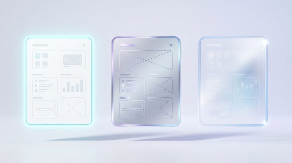
Glowing borders are among the most recognizable options. They use colored shadows or blurred gradient layers to create an illuminated outline around a card. The glow can remain static or become stronger when a visitor hovers over the component. This approach is particularly useful for featured products, selected pricing plans, and important interface elements.
Animated gradient borders introduce movement through changing colors or rotating gradients. A common implementation uses CSS conic-gradient() to create a circular color transition around the card. When the gradient angle changes over time, the border appears to rotate even though the card itself remains stationary.
Holographic effects imitate the reflective appearance of metallic or rainbow-colored surfaces. They are often associated with collectible cards, gaming interfaces, creative portfolios, and digital artwork. These designs may combine gradient layers, blend modes, reflections, and pointer-based lighting.
Glassmorphism borders use transparency, subtle outlines, and background blur to create a glass-like appearance. They work particularly well when the surrounding interface contains soft colors or layered backgrounds. However, sufficient contrast must be maintained so that text remains readable.
Border beam effects create the impression of a small beam of light traveling around a card’s edges. Instead of illuminating the entire outline equally, the design emphasizes a moving section. This makes it useful for highlighting featured components without covering the whole interface in bright colors.
Another option is the simple hover border effect. The outline changes color, thickness, or brightness when someone places a cursor over the card. It is less demanding than a continuous animation and often provides a better experience for content-heavy websites.
Choosing an appropriate AI card edge effect depends on the content, brand identity, and intended interaction. A SaaS dashboard may benefit from a subtle gradient, whereas a collectible card interface can support more expressive holographic styling.
The objective is not to use every available effect. It is to choose one treatment that strengthens the card’s purpose and keeps the overall interface visually balanced.
Best AI Tools for Creating Card Effects
The right tool depends on whether the goal is to create a visual concept, design an editable interface, or produce functional frontend code. Not every AI platform performs all three tasks equally well, so selecting a tool based on the actual requirement can save time.
ChatGPT can help developers plan card components, write CSS, explain animation techniques, troubleshoot errors, and refine prompts. It is particularly useful when someone wants to understand why a border effect works rather than simply copy an existing design.
Cursor is an AI-assisted code editor that can help developers create and modify components within an existing codebase. It can be useful when a project already contains HTML, CSS, React, or other frontend technologies. Developers can request a specific border animation and review the suggested changes in context.
v0 is another option for generating interface components from written descriptions. It can help users explore card layouts and frontend design directions, especially when working with modern web application interfaces.
Figma’s AI features can support early interface exploration and design iteration. Designers can use AI-assisted workflows to generate or refine interface concepts before translating the selected design into production code.
These tools serve different purposes. A visual design platform is more suitable for exploring appearance, while a code-focused assistant is more appropriate for implementing CSS behavior.
When evaluating an AI tool, consider whether it supports editable output, reusable components, responsive layouts, and the framework used in your project. Also check whether generated code introduces unnecessary dependencies or relies on features that may not work in older browsers.
A useful approach is to begin with a simple card and ask the tool to create several variations. Compare the visual quality, code structure, responsiveness, and ease of customization before selecting a final version.
For more reliable results, provide the tool with the existing design system rather than asking it to invent every visual detail. This includes your brand colors, typography, spacing rules, and preferred corner radius.
AI tools can make experimentation easier, but they do not replace frontend knowledge. Developers should understand the generated properties well enough to maintain and troubleshoot them later.
How to Create Glowing Card Borders With AI
Creating a glowing card border becomes much easier when the process is divided into small steps. The aim is to produce a clear outline with controlled illumination while keeping the content inside the card unaffected.
Start by defining the card’s basic structure. Decide its width, background color, corner radius, padding, and content hierarchy. These details should be established before adding animation because the border needs to follow the card’s actual dimensions.
Next, use an AI coding assistant to generate a simple HTML and CSS component. A useful prompt could be:
“Create a responsive website card with rounded corners, a thin cyan-to-violet gradient border, and a subtle outer glow. Use CSS pseudo-elements, keep the content readable, and activate the animation only when the card is hovered. Include a reduced-motion alternative.”
Once the initial code is generated, review how the border is constructed. One practical method uses a pseudo-element positioned behind the card. A conic gradient supplies the colors, while a second blurred layer creates the outer glow.
Here is a simplified CSS example:
.card {
position: relative;
isolation: isolate;
padding: 24px;
border-radius: 16px;
background: #ffffff;
z-index: 0;
}
.card::before,
.card::after {
content: “”;
position: absolute;
inset: -2px;
border-radius: inherit;
background: conic-gradient(
#38bdf8,
#8b5cf6,
#22d3ee,
#38bdf8
);
z-index: -1;
}
.card::after {
filter: blur(14px);
opacity: 0.45;
}
This example creates a static gradient outline and a soft glow. It does not yet rotate the gradient. Animation can be added through a registered CSS custom property and keyframes, but it should be tested in the browsers supported by the project.
After implementing the border, adjust its thickness and glow intensity. A two-pixel outline is often sufficient for a compact interface card. Larger blur values may create a softer appearance, but excessive blur can make the card look unclear.
Finally, test the component on mobile and desktop screens. Check whether the glow is clipped by parent containers, whether the corners align correctly, and whether text remains readable.
The real advantage of an AI card edge effect workflow is the ability to generate an initial implementation quickly and improve it through focused revisions. The finished result should still be reviewed and optimized by a developer.
Also Read: Starkey Edge AI: Features, Benefits, and Performance
CSS Techniques Behind Animated Card Edges
CSS provides most of the functionality required to create modern animated card borders without depending on large JavaScript libraries. Understanding a few important properties makes it easier to customize generated components and resolve common visual problems.
The first technique is conic-gradient(). Unlike a linear gradient, which transitions along a straight line, a conic gradient distributes colors around a central point. This makes it particularly suitable for circular or rotating border designs.
Another important feature is CSS pseudo-elements. The ::before and ::after selectors allow developers to add decorative layers without placing additional HTML elements inside every card. One layer can display the gradient border, while another creates the blurred illumination.
CSS custom properties provide a convenient way to control colors, dimensions, and animation values. For example, a developer can define a border color or animation duration once and reuse it across multiple components.
The @property rule offers another useful technique. It allows developers to register a custom property with a defined data type. When an angle is registered as an angle, the browser can interpolate its value smoothly during an animation.
A simplified example looks like this:
@property –angle {
syntax: “<angle>”;
initial-value: 0deg;
inherits: false;
}
@keyframes rotate-border {
to {
–angle: 360deg;
}
}
The registered angle can then be used inside a conic gradient. This creates a smooth rotating color transition instead of an abrupt change between two gradient images.
CSS masking is another useful technique. Properties such as mask-composite can help remove the center of a gradient layer, leaving only a narrow ring around the card. This is especially useful when the middle of the card needs to remain transparent.
For a practical AI card edge effect, developers should also understand filter: blur(), border-radius, overflow, isolation, and z-index. These properties determine how the glow appears, how the corners align, and whether decorative layers remain behind the card content.
Not every implementation requires all these techniques. A static gradient border may only need layered backgrounds, while an animated holographic design may require multiple layers and pointer-based interactions.
The best approach is to use the simplest CSS structure that produces the desired result. Complex effects should be introduced only when they provide a visible improvement.
Common Design Mistakes and How to Avoid Them
A visually impressive card is not automatically a good interface component. Many designs fail because too much attention is given to decoration while readability, performance, and usability are overlooked.
One common mistake is excessive glow. When the shadow is too bright or spreads too far beyond the border, it competes with the card’s text and surrounding content. Use a restrained blur and moderate opacity so that the outline remains visible without dominating the interface.
Another problem is inconsistent styling. If every card on a website uses a different gradient, animation speed, or corner radius, the interface can feel disconnected. Establish a small set of reusable design rules and apply them consistently.
Continuous animation is another issue. A page containing ten or fifteen cards with constantly rotating borders can become visually exhausting. It can also increase rendering work, particularly when large gradient layers are animated simultaneously.
A better solution is to animate only selected cards or activate effects on hover and focus. Always consider the prefers-reduced-motion media query so visitors who request reduced motion receive a calmer experience.
Contrast should also be checked carefully. A bright border does not guarantee that the text inside the card is readable. Text color, background transparency, and interactive states should be evaluated independently.
Mobile usability deserves special attention. Hover interactions are not available in the same way on touchscreens, so important information should never depend exclusively on a hover animation. The card should remain understandable and usable without that interaction.
There are also technical mistakes. Poorly positioned pseudo-elements may disappear behind parent backgrounds, while incorrect overflow: hidden settings can cut off the outer glow. Large blurred areas may create unnecessary rendering costs.
To avoid these problems, test the component at different viewport sizes, inspect it in multiple browsers, and measure performance instead of relying only on appearance.
An effective AI card edge effect should support the interface rather than become its main distraction. Simplicity, consistency, accessibility, and responsive behavior are more important than adding another animation.
Also Read: AI Edging: How It Works, Benefits and Applications
Future of AI-Powered Card Design
AI-assisted interface design is moving beyond generating static visual concepts. Modern tools can increasingly help designers explore component variations, create frontend code, refine existing layouts, and connect visual instructions with implementation workflows.
One promising direction is more personalized interface styling. Designers may be able to generate different card appearances based on the content, audience, or purpose of a particular section. For example, a dashboard could use restrained outlines for general information and more noticeable effects for urgent notifications.
Interactive lighting is another area of development. Pointer tracking can make a reflective highlight follow the user’s cursor, creating the impression of a physical surface. Combined with gradient layers and carefully controlled motion, this can produce more engaging product cards and digital collectibles.
Reusable design systems will also become increasingly important. Rather than generating every component independently, developers can use AI to adapt a consistent card design across different pages and applications. This can help maintain common spacing, colors, typography, and interaction patterns.
Another important direction is the relationship between AI-generated code and production quality. Generating a working prototype is only one part of development. Real websites also need accessible interactions, predictable browser behavior, optimized assets, and maintainable code. Future workflows will be more useful when they help developers check these requirements rather than focusing exclusively on visual output.
Performance-conscious animation is likely to remain important as well. Lightweight CSS effects, selective motion, and responsive rendering can help maintain a smooth experience on devices with different capabilities.
However, more automation does not mean that every interface needs complex visual effects. A simple border can be more effective than a continuously moving gradient, particularly on business websites and information-heavy dashboards.
The future of AI card edge effect design will therefore depend on combining creative experimentation with practical frontend engineering. AI can reduce the time needed to explore possibilities, but thoughtful design decisions will continue to determine whether a component is genuinely useful.
Frequently Asked Questions
What is an AI card edge effect?
It is an AI-assisted design approach for creating visual treatments around digital card borders, including glowing outlines, gradient transitions, holographic reflections, and animated lighting.
Can AI create animated card borders?
Yes. AI coding assistants can generate HTML and CSS for animated borders. Developers can then refine the animation, test browser support, and adjust the design.
Which CSS property is used for glowing card borders?
Common properties include box-shadow, filter: blur(), conic-gradient(), CSS pseudo-elements, and custom properties. The combination depends on the desired effect.
Are animated gradient borders suitable for mobile websites?
Yes, when implemented carefully. Animations should be lightweight, touch interactions should not depend on hover, and users who prefer reduced motion should have an appropriate alternative.
Do AI-generated card effects require JavaScript?
No. Many gradient borders, glowing outlines, and rotating animations can be created entirely with CSS. JavaScript is only needed for more advanced interactions, such as tracking pointer positions or dynamically changing component states.
How can I make card edge effects look more professional?
Use a consistent color palette, appropriate border thickness, controlled glow intensity, readable content, and subtle animation. Test the result on different devices before publishing.
Conclusion
Card borders may appear to be a small part of website design, but they can make a noticeable difference in how an interface communicates information. From subtle gradient outlines to animated lighting and holographic reflections, there are many ways to make digital cards more engaging.
AI-assisted tools make it easier to explore these possibilities, generate implementation ideas, and experiment with different visual directions. However, the quality of the finished component still depends on careful CSS implementation, accessibility, responsiveness, and performance testing.
The most useful approach is to begin with a clear design objective, select an appropriate effect, and refine it until it supports the content naturally. When visual creativity and sound frontend practices work together, card designs can become more attractive without sacrificing usability.